Analysis tabs.
The most common type of analysis is a time-series analysis. Meaning, you’re evaluating some set of metrics over a time period. You might evaluate complementary metrics, visualize your data, or build a forecast or extrapolation.
Here’s Bobby one more time with what to expect to learn in this section of the guide.
Watch on YouTube
Before we jump into how to build a time-series analysis, you need to learn one simple formula. It will unlock and change how you use a spreadsheet forever–this is not an overstatement.
The MOST important function to know
SUMIFS is the single most important and powerful function in a spreadsheet. It will unlock nearly any analysis for you. It’s a secret that most advanced spreadsheet-ers know about. Once you understand how to use it, you’ll clearly understand why we architected our Data tabs the way we did.
How SUMIFS works
SUMIFS works just like it sounds. It SUMS across a range IF certain criteria are met. It takes 3 arguments:
- The range across which you want it to sum, known as the
sum_range - The range across which you want it to check for the criteria, known as the
criteria_range - The
criterionfor which you want it to check
=SUMIFS( sum_range , criteria_range , criterion ). This would return the sum of the sum_range when the row in the criteria_range matches the criterion. You can add as many criteria_range and criterion arguments as you’d like. It’s infinitely extensible. For example:
=SUMIFS( sum_range_1, criteria_range_1, criterion_1, criteria_range_2, criterion_2, criteria_range3, criterion_3…)
An example using SUMIFS
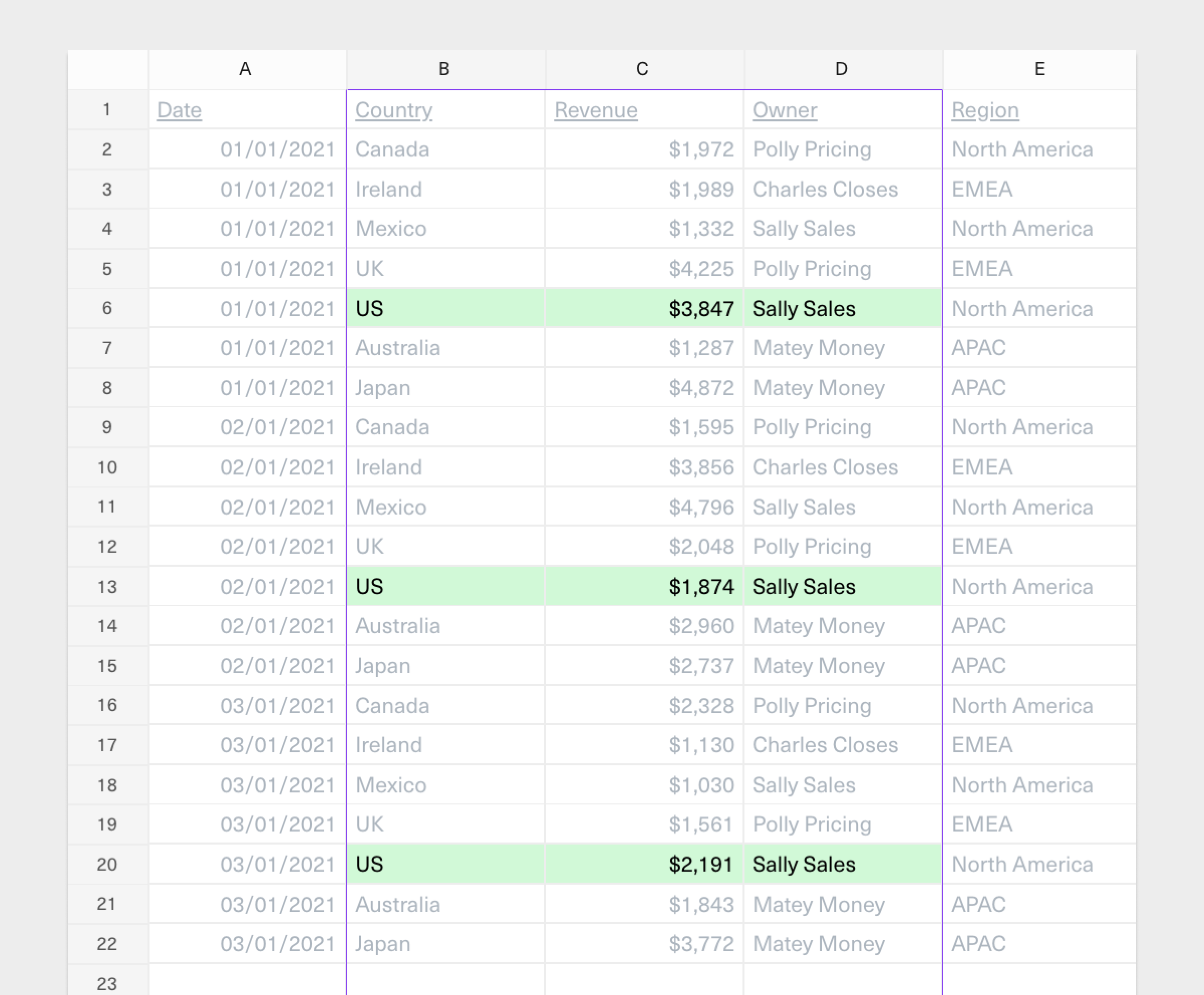
Using a sample of our country revenue data introduced in the previous section, let’s imagine we want to calculate the total revenue owned by Sally Sales, the VP of Sales.
This is easy using the SUMIFS:
- We want the function to return a sum of revenue so our
sum_rangemust reference column C because that’s where our revenue data lives. - Our criterion is “Sally Sales”, so our
criteria_rangeneeds to reference column D since that’s where we’ll check to see if the revenue being summed is owned by Sally Sales.
=SUMIFS(C:C, D:D, "Sally Sales"). That’s simple, but let’s explain how it works one level deeper.
Imagine you are the spreadsheet. Evaluating this function would look something like the screenshot below, where you’re only summing the revenue values highlighted in column C (the sum_range) because the owner of that revenue (column D, the criterion_range) matches our criterion, Sally Sales.
The returning value here is $15,070 = $1,332 + $3,847 + $4,796 + $1,874 + $1,030 + $2,191.
Now let’s say we wanted to drill down further and only sum for revenue owned by Sally Sales in the US. To do so, we add another criteria_range and criterion to our original function:
=SUMIFS(C:C, D:D, "Sally Sales", B:B, “US”)
$7,912 = $3,847 + $1,874 + $2,191. That’s the total revenue owned by Sally Sales in the US.
We could extend our SUMIFS function yet again, and as many times as we’d like. Imagine we wanted to drill down and look at Sally Sales’ total revenue in the US in January. You can imagine how we’d do that, although we’ll show you a trick to make date-parsing 10x easier in the next section.
Now that you understand the fundamentals of how the SUMIFS function works, you see that we’ve architected our Data tab to make it easy to use it.
Advanced uses of SUMIFS and other related functions
As you experiment and familiarize yourself with SUMIFS here are some deeper details to know:
-
In each example shown, the
criterionhas been a manual value. For example, “US” or “Sally Sales.” It does not have to be a manual value. Best practice is to never manually hard code values into your formulas. It can take a cell reference and use whatever the value of that cell reference is to evaluate. -
COUNTIFSis another powerful function that takes the same arguments but returns a count of matching cells instead of the sum of values in the referenced range. You might use this if the range you are referencing is not a number but something like customer name. You can’t sum customer names, so you might be looking to count them. -
Another fun one that doesn’t exist in Excel but is useful in Equals is the
COUNTUNIQUEIFSfunction. It works just likeCOUNTIFS()but only counts unique values. For example, you could imagine using this to count the number of unique customers in a data set. -
SUMIF()andCOUNTIF()are other versions of theSUMIFSandCOUNTIFSfunctions. They work the same way, but stupidly they reverse the arguments and only take onecriteria_rangeandcriterion, hence why they’re not pluralized. For example,=SUMIF(criteria_range, criterion, sum_range). Thanks, Excel, for making this confusing. 🙃 -
Criterioncan also be something conditional. So you can ask it to evaluate if it’s a match and if the value is greater than or less than a certain value. From the example above, let’s say we wanted to sum revenue in the US owned by Sally Sales in months that generated more than $2,000. We’ll add another condition that looks like this:=SUMIFS(C:C, D:D, "Sally Sales", B:B, “US”, C:C, “>2000”).
Working with dates
It can be frustrating and tricky to work with dates in a spreadsheet. Formulas get complex and convoluted quickly, and date parsing is one of the most common areas of mistakes. Best practice is to keep things simple and modular. Now that we understand theSUMIFS function, we have some simple tools we can use to make working with dates easier.
Let’s imagine from our example that we wanted to summarize revenue from our Data tab by month. We’ll create a simple table like this in a new Analysis tab.
We’ll use the SUMIFS to return the total amount of revenue for each month.
The SUMIFS function evaluates based on the referenced data in theData tab like this:
Modularize dates for more robust analyses
That works. However, it’s dangerous because it’s not very robust. Why? We’ve set everything to be conditional on an exact date–the first of every month. The problem with that is if our dataset referenced in theData tab changes or if new rows get added where Date does not exactly adhere to the first of every month (a common issue here is a timestamp might return that’s not the exact same hour and second), our SUMIFSfunction will evaluate incorrectly.
Best practice is to modularize our dates, and doing so is simple. To do this, we’ll expand our Data tab to extract month, year, and day as separate columns using some standard functions.
We’ll use the MONTH, YEAR, and DAY functions. Each takes one cell reference as an input (a date) and then returns an integer representing the month, year, or day. Remember, if you’re using Equals, these can be added alongside your live data set as calculated columns so they auto-expand as your data set expands.
Now that we have the month, year, and day returned in three respective columns in our Data tab we can go back to our the summary table in our Analysis taband make it more robust.
We’ll do this by modifying our SUMIFS function to reference column F as the criteria_range for the month and column G as the criteria_range for the year. In this case, we don’t need to worry about the day because our analysis sums revenue by month.
Now we know that no matter what format the date returns in the Data tabwhether it’s the first of the month, end of the month, or a specific timestamp with hours and seconds, our SUMIFS function will evaluate correctly.
That’s the most powerful way to ensure that dates don’t break your analysis. Now, for a couple of other simple things to make working with dates easier and build deeper analyses.
Using functions to calculate specific dates
Days and weeks are pretty simple to navigate. You can always+1 or +7 to a date and get the daily or weekly interval.
Monthly intervals are trickier because they’re not consistent. But it’s often the most common way we look at analysis. There are two functions to make this easier.
EDATE
This function adds or subtracts a specific number of months from a date. To do so, change the second argument to the interval you want calculated.
EOMONTH
This function takes a date and returns the last day of the month within a given interval.
So if we want the last day of any given month, it’s just =EOMONTH(reference, 0). We can increment the 0 here to get the last day of the month for any increment of months beyond the referenced cell.
Locking rows and columns
Using the spreadsheet’s locking mechanism is one of the most powerful ways to build formulas and functions that scale as your dataset expands. By default, when you copy (or drag) a formula or function from one cell to another, references update, which can break your analysis. For example, if I were to copy the formula in cellA2 below across, B2 would reference B1, and C2 would reference C1 as you’d expect.
However, there might be instances where we don’t want certain references in the formula to change and instead remain fixed. For example, let’s say we wanted to build a simple multiplication table that showed the product of a row and a column, i.e., across row 3: 1x1, 1x2, 1x3…
You can see how copying that formula across the table won’t work. We wouldn’t get the product of the rows and columns; we’d get the product of the adjacent cells. This is not what we want.
Instead of manually creating a formula for every calculated cell in the table, because copy/paste here doesn’t work, spreadsheets have a neat trick. You can lock references by placing a $ next to the referenced column or row number you want to lock in the formula. Placing a $ next to both the column letter and row number will lock to that exact cell, e.g., $C$5.
Let’s say we wanted to make our formula in cell B3 easily able to be copied across adjacent cells in row 3, we’d want to lock the reference to cell A3 as follows.
We’re only locking column A here because we’ll also want to copy this formula down later and change the row referenced.
You’ll see now, as we drag our formula across row 3, $A3 remains reference correctly.
To complete filling our multiplication table, we must modify the reference to row 2 in this calculation. We want to lock row 2 like this:
Now, this formula can be dragged across and down our table.
There you go; you’ve written one formula that will work for all 25 cells in the table and is infinitely extensible if we want to make the multiplication table bigger.
Finally, let’s say we wanted to multiply every value in the table by the same number – 10. To do so, instead of modifying the formula in every calculated cell, we’ll create a new reference cell (i.e., a global filter) to add to our existing formula. And we’ll lock that new reference cell’s rows and columns (i.e., $D$1), so every calculated cell in our multiplication table is multiplied by the same amount–10 in the example below).
We can copy one formula across our table, and all the references and results are correct. Again, this scales infinitely as you expand your multiplication table.
Knowing how to lock rows and columns becomes handy as we build an analysis.
Setting up an Analysis tab
This section will cover how to build a time series analysis. We’ll examine a set of metrics and compare them over time. Now that we understand theSUMIFS function and date parsing we can put together our analysis. As you can imagine, we’re going to rely heavily on SUMIFS. We’re going to architect our Analysis tab so that our formulas are robust, scalable, and reusable.
The best practice for time series analysis is to set columns to represent the date period and rows to represent the dimensions.
Depending on what you’re analysing and its purpose, you might choose to group certain dimensions together. For instance, from our revenue example earlier, if we were building an analysis that wanted to look into the performance of each VP of Sales, we’d probably organize things this way:
Alternatively, if we were building an analysis to understand whether there are different patterns in sales by region instead of by the owner, we’d probably want to group our regions together.
You’ll note that we’ve used the dimension names that match exactly how they appear on our Data tab. This will allow us to use the same SUMIFS function across our entire summary table. This means we only have to write one formula that can be used to calculate all of the highlighted cells below.
Once we create the formula, it’s a simple copy and paste (or drag across and down). Similarly, that formula will continue to work as we expand our analysis over time, especially given we’ve locked our references appropriately using $.
You’ll see this use ofSUMIFS looks to sum column C (Revenue) in our Data tab when column B matches column B in our Analysis tab, and when the month and year in row 2 match the months and year columns (columns F and G) in our Data tab.
From here, we can copy and paste (or drag) this formula across our entire table and a few simple SUM formulas to total revenue by region by month (i.e., rows 6, 10, and 14).
You’ll see the formula in cell C13 is the exact same as the original formula we entered in cell C3. Only the cell reference for the country ($B13 vs. $B3) have been updated as we dragged the formula down the table. This is what we want, as it means the formula is correctly referencing the respective rows from our Data tab i.e., revenue from Japan instead of revenue from the US in January 2021.
Working with dynamic ranges
Dynamic ranges are a powerful way to set up analysis so you don’t have to constantly rework a workbook to show you what you need. Because we set up our summary table as shown in the previous section to calculate from our dimensions and headers, we can use those to calculate the contents of our table as the dimensions and headers change over time. To do this, we’ll use theEDATE function in our headers to make our time series analysis dynamic based on the date we want to start.
Below, our summary tables start in January 2021 and show revenue by region for the next two months.
If we modify cell C2, because the rest of our headers in row 2 use the EDATE function, the rest of the table automatically updates based on cell C2:
If you want the table to always reflect the most recent 3 months, you can use the TODAY and EDATE function together. So in cell C2 above, you could write =EDATE(today(), -3) and that would return the date 3 months ago from today.
Using global filters
If we wanted the table to show revenue figures for a specific VP of Sales dynamically, we must move our table down one row and put an input value inC1. We will also need to add that criteria_range and criterion to our SUMIFS function.
Now you’ll see our table automatically update as we input the name of a specific VP of Sales into the global filter (cell C1). Remember, this is taking advantage of the Input tab we created in the previous section, which houses the names of all the VPs of sales and the regions they own.
Dynamic ranges are a powerful way to set up analysis so you don’t have to constantly rework a workbook to show you what you need. For example, looking at six months of historicals might always be useful–no more. Create 6 columns and update the date fields across the columns; don’t continue to drag out the analysis and hide data.
Auto-expanding summary tables
Equals has a nifty feature called Auto-expand that enables tables, charts, and pivot tables to automatically update with each query run. This is useful for ensuring that analyses are up-to-date without the need to manually copy and paste data or expand ranges on charts and pivots.Sharing analyses
Now that you’ve built an analysis that uncovers some meaningful insights, it’s time to consider how to share them. Most companies’ current state of analyses looks like this: A fancy new analysis is created, but it lives in yet another silo. No one logs into the BI tool to check what’s changed, which takes forever to load. Ultimately, the analysis does not drive meaningful decisions and has no real impact. How do you avoid this? If you want your insights to drive accountability and action, you must ensure that they are presented clearly, accessed easily, and regularly updated. This is where dashboards can help.Building a dashboard
Your analysis likely includes a lot of exploration and detail. But when it comes to thoughtfully presenting the insights, you need to take an editorial eye. That means crafting the business narrative to align with your audience’s interests and areas of influence. What do your stakeholders care most about, and what are they focused on contributing to the business? Present only the tables, charts, and metrics from your analysis that tell a clear story without overwhelming the audience. Organize these elements in a logical order that guides stakeholders through your findings. Focus on only the most relevant views given their respective roles and responsibilities.Instantly turn spreadsheets into dashboards
Every Equals workbook has an embedded dashboard. Building one is as simple as creating a doc–complete with tables, charts, cells, and AI-generated summaries.Distributing dashboards
The key here is to create fast feedback loops. Launch something on Product Hunt? Introduce a new page into the onboarding flow? It’s crucial to proactively check early indicators of impact so that the business can catch issues and capitalize on opportunities. Speed is a startup’s competitive advantage, and it’s your job to maximize speed to insight so the business can respond faster. That means:- Deliver dashboards_where_ stakeholders are. Push reports directly to your stakeholders where they are already working, including Slack and email. Embed them directly, no downloads or logins required. The more accessible your dashboards are, the greater the likelihood of engagement and timely action.
- Deliver dashboards_when_ stakeholders need them. Schedule your dashboards to deliver at a regular cadence that matches the business’s metabolism, whether hourly, daily, weekly or monthly. Create a culture of transparency and accountability by driving regular check-ins, highlighting what’s changed, and assigning owners to chase down root causes and potential solutions.
Report on autopilot
In Equals, use the dashboard scheduler to auto-distribute reports to either email or Slack on a custom schedule–hourly, daily, weekly, or monthly.In Summary:
- Time-Series is the most common type of of analysis. Use it to evaluate metrics over time, visualize data, and build forecasts.
- SUMIFS is the most important and powerful function to learn for building robust analyses. It sums data based on multiple criteria and is the key to unlocking advanced analysis techniques.
- Modularize dates using the MONTH, YEAR, DAY, EDATE, and EOMONTH functions to build scaleable analyses that don’t break.
- Utilize $ to lock references in formulas, so you only have to write a formula once, enabling scalable and reusable spreadsheet setups.
- Present your insights using dashboards that are auto-distributed on a schdule to stakeholders in Slack or email, increasing visibility and encouraging timely decision-making.
What’s Next