Data tabs are the foundation of your analysis. They’re where you house and prepare your data. Here, we’ll walk through how to structure your queried data in a tabular format to ensure you can build a scalable analysis.
Here’s Bobby with a quick walkthrough of what you can expect to learn.
Watch on YouTube
Setting up a Data tab
When setting up a query (i.e., a data pull), the best practice is to condense like attributes into a singular column. For instance, a single column denotes the location and another transaction amount. Also, be sure to aggregate data at its minimum level of granularity. For example, group by day, month, or year. Let’s walk through an example: Imagine we want to set up aData tab to power a revenue-by-country analysis. The WRONG way would be to set one up like the example below, where revenue for each country is broken out into multiple columns.
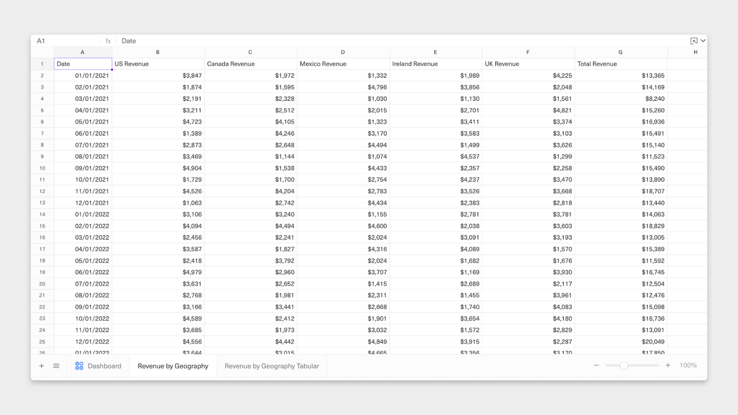
Analysis tab, you’ll have to change reference columns for every country. You won’t be able to reuse formulas (we’ll walk you through this later), creating redundancy and more work for you.
Similarly, if we wanted to add a new country, say Australia or Japan, we’d have to insert a new column and move our Total Revenue (column G above) over. Consequently, we must update the Data tab and rework any Analysis tabs to reference the new columns correctly.
So, what’s a better approach? Collapse all countries into one single column. Here’s the CORRECT way to set up this Data tab.
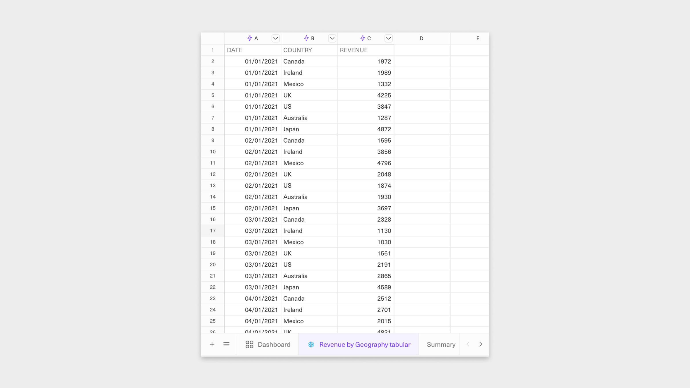
Analysis tab, we only have to reference column C (Revenue) vs. every individual country column for any revenue calculations. And if we want to add other countries down the line, the structure of the Data tab doesn’t need to change.
Query datasources in your spreadsheet
In Equals, connected sheets allow you to query datasources directly from your workbook, making it easy to build analyses with live data.Infinity Sheets
Infinity sheets are only supported when connected to datasources stored in the Equals data warehouse.Converting to Equals Infinity
By default, Equals workbooks have a 5 million cell limit. If exceeded, workbook performance may begin to slow down. If you need to work with data beyond the above limits, you can use Equals Infinity. Equals Infinity allows you to query and analyze significantly larger datasets without row or cell limits. However, it does come with some limitations compared to standard sheets, including no support for calculated or notes columns, and the inability to build pivot tables or charts directly on Infinity data. To switch to an infinity sheet, open your Query Builder / SQL Editor window, then select the down arrow next to “Run Query.” A pop-up window will appear saying “Convert to infinity and run.” Clicking that button will swap your sheet to an Infinity sheet.Enriching and expanding your Data tab
The other benefit of this tabular format is that the data is now structured, so expanding our analysis is simple and scalable. For example, we know that we need to analyze revenue byCountry, but we might also need to be prepared to ask questions about revenue based on who owns it (i.e., a specific VP of Sales) and perhaps also based on the Region a given country rolls up to.
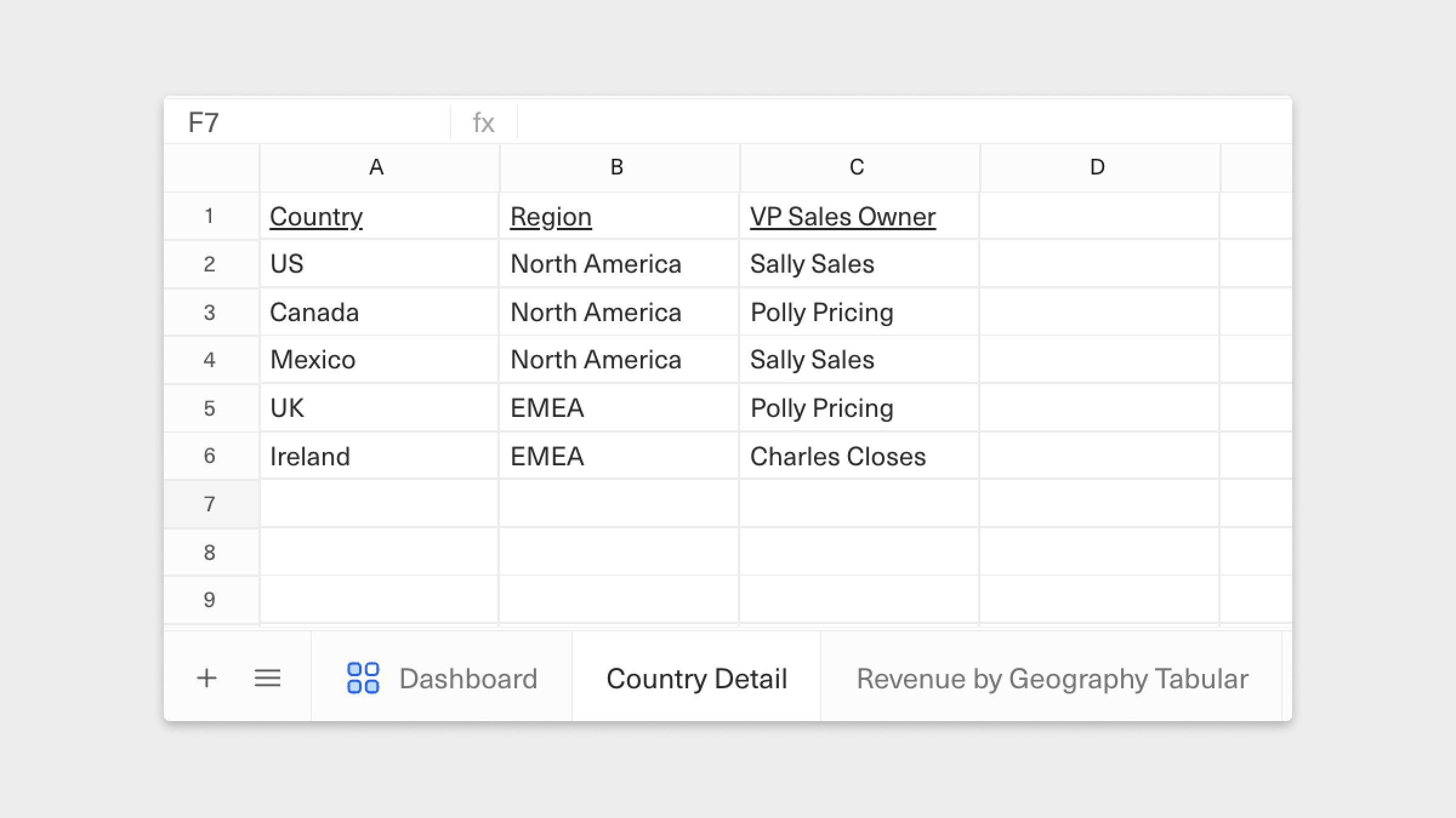
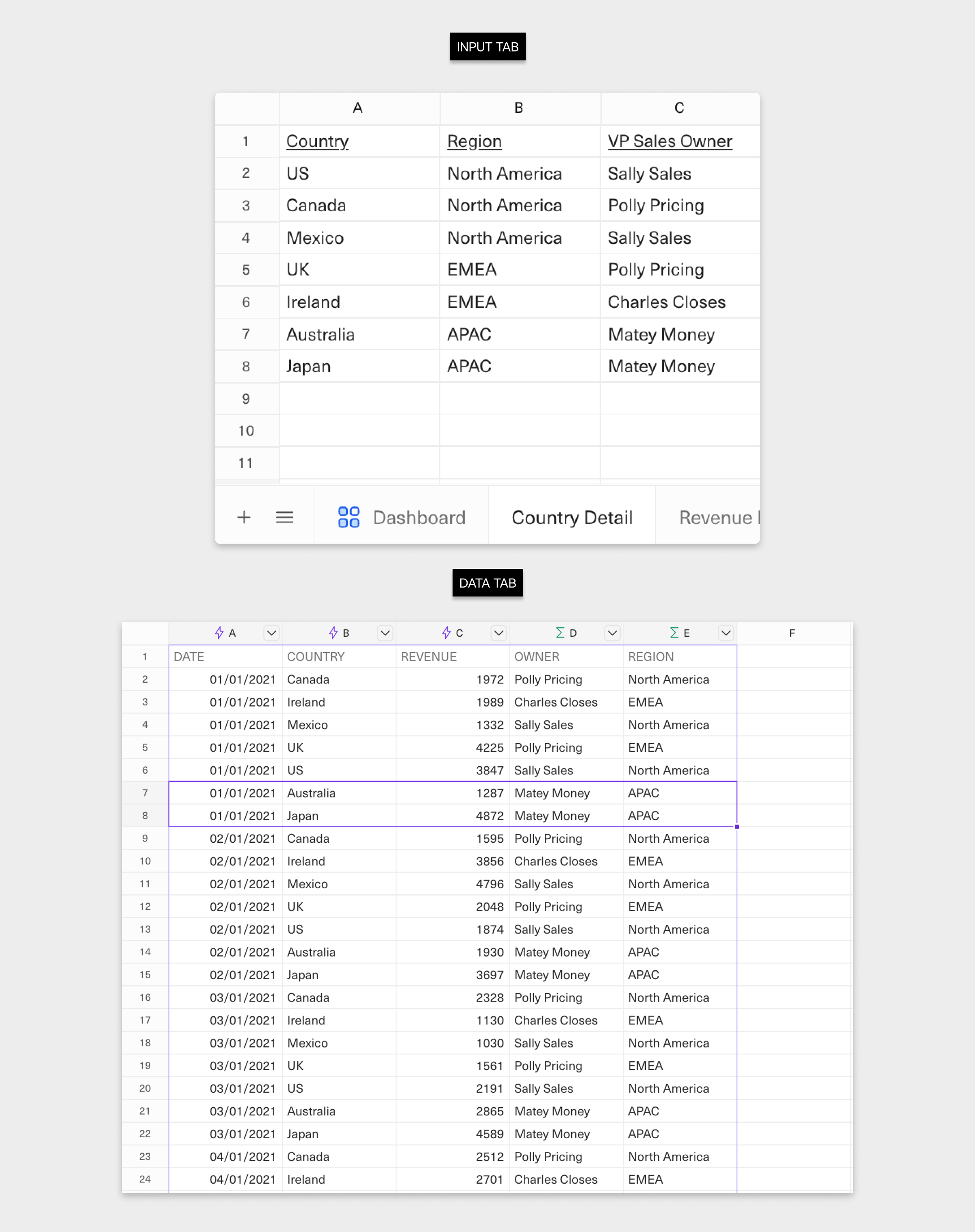
This is where Input tabs become useful. Below is an example of one that summarizes Country Details. While it may seem overly simple, it’s worth maintaining separately–you’ll see why later.
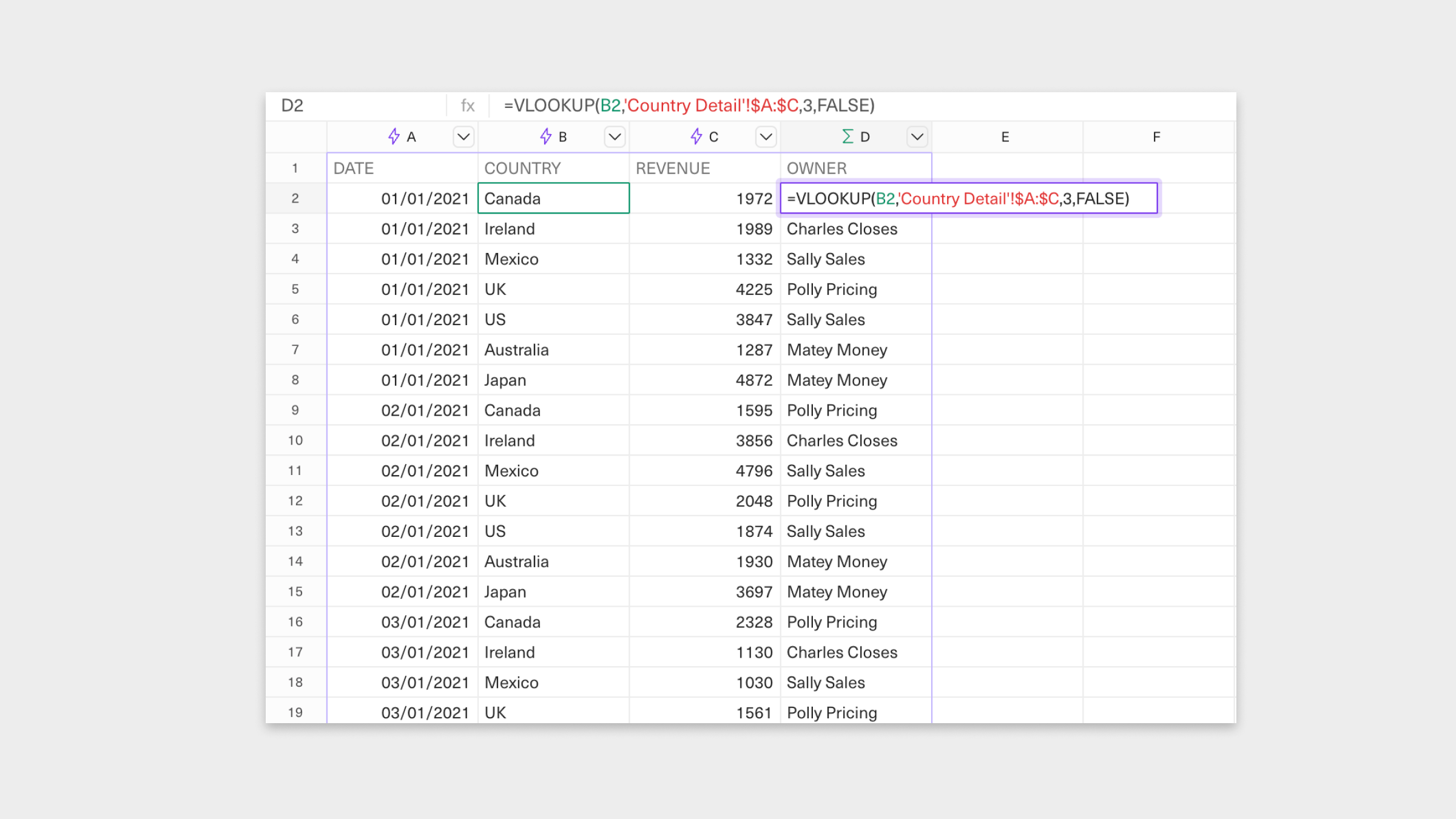
Data tab to return the VP Sales Owner for each Country returned by our query. We’ll do this by adding a new column, Owner, to our tabular data set and use the VLOOKUP formula to return the specific value in a data set that matches an input value.
Auto-expand formulas as your data set grows
In Equals, columns that contain functions/formulas alongside a dataset returned from a query are called Calculated columns. They’re great because they auto-expand as your data set expands, so you don’t have to do so manually.Analysis tab. First, let’s see how scalable this is by adding more countries from a new region, e.g., Australia and Japan from APAC.
Because we’ve set up our Data tab correctly, all we have to do is add two rows to our Input tab. Now, the Owner and Region columns in the Data tab will automatically update whenever the query returns data for Australia and Japan.
Data tab, and imagine trying to add things likeRegion and Owners or new countries. It’d be a bunch of extra work and time wasted.
In summary:
- Structure your query results in
Data tabsin a tabular format - Expand
Data tabsdownwards by adding new rows - Avoid queries that add new data by adding additional columns
- Append calculations and additional metadata alongside your query results using
Input tabs
Data tab in tabular format as we explore building out an analysis.
What’s Next