- Line
- Combo
- Scatter
- Area, stacked area, and 100% stacked area
- Column, stacked column, and 100% stacked column
- Bar, stacked bar, and 100% stacked bar
- Pie
Creating charts
To get started, select your date range, then go toInsert > Chart or use the shortcut CMD+K and type Insert chart. This will insert a default chart into your workbook and open the chart configuration panel.
Charts have the following defaults for a clean look:
- The title and legend are left-aligned
- Y-axis labels but no line
- Horizontal gridlines only
- No data labels are displayed on series
- ‘Professional’ style (more on styles here)
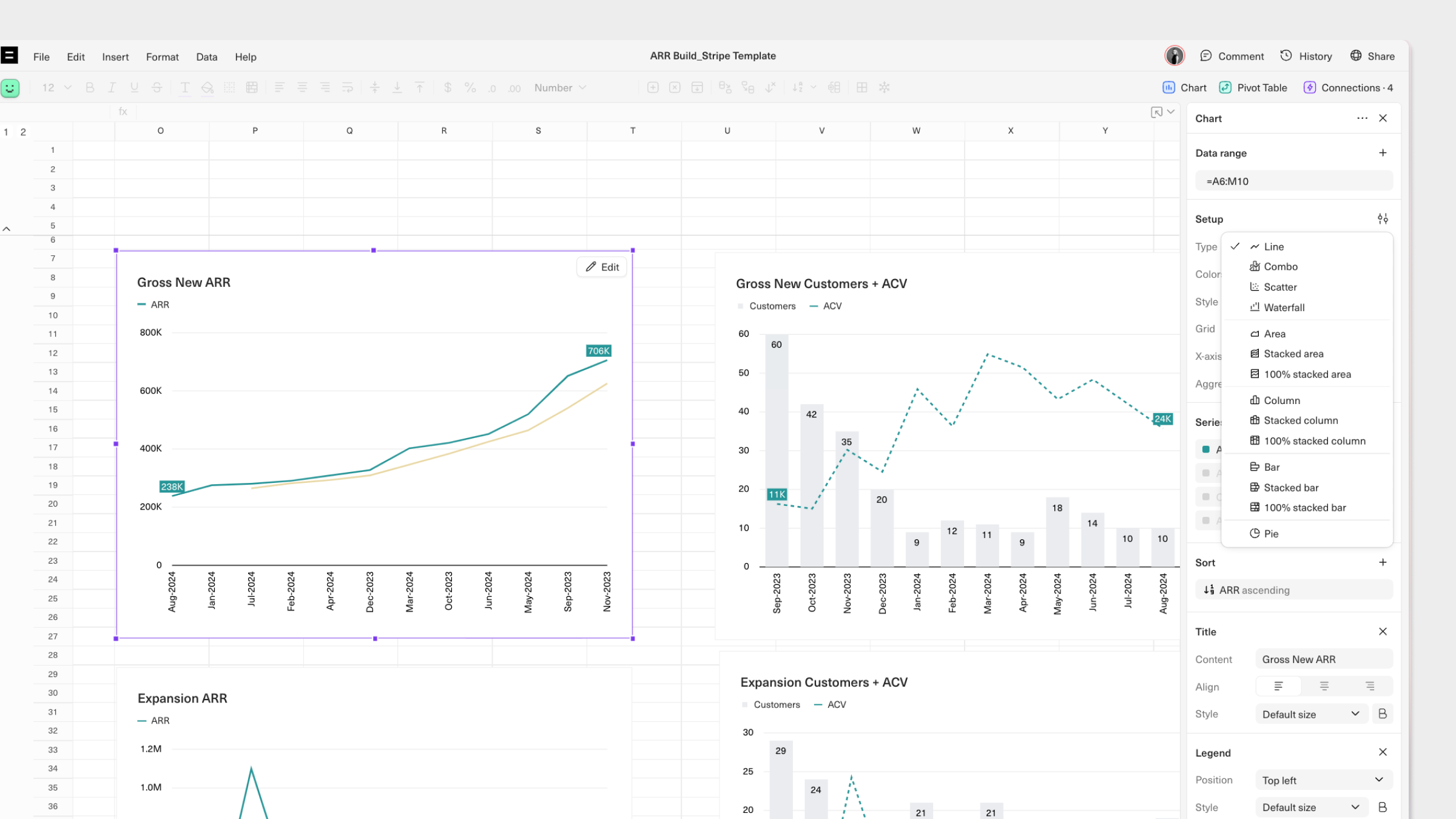
- Type: Select either Line, Scatter, Combo, Area, Column, Bar, or Pie. Stacked and 100% stacked variations are available for Area, Column, and Bar charts.
- X-axis: Set a specific metric for your X-axis, which will define the data point intervals.
- Series Selection: Click on the series from to edit how they are displayed in your chart.
Customizing Charts
You can configure the look and feel of each aspect of your chart to suit specific use cases. There are 5 aspects of your chart that you can configure:- Chart
- Series
- X-axis
- Left Y-axis
- Right Y-axis
Chart
Here, you can configure your chart’s style, colors, legend, and title.Styles
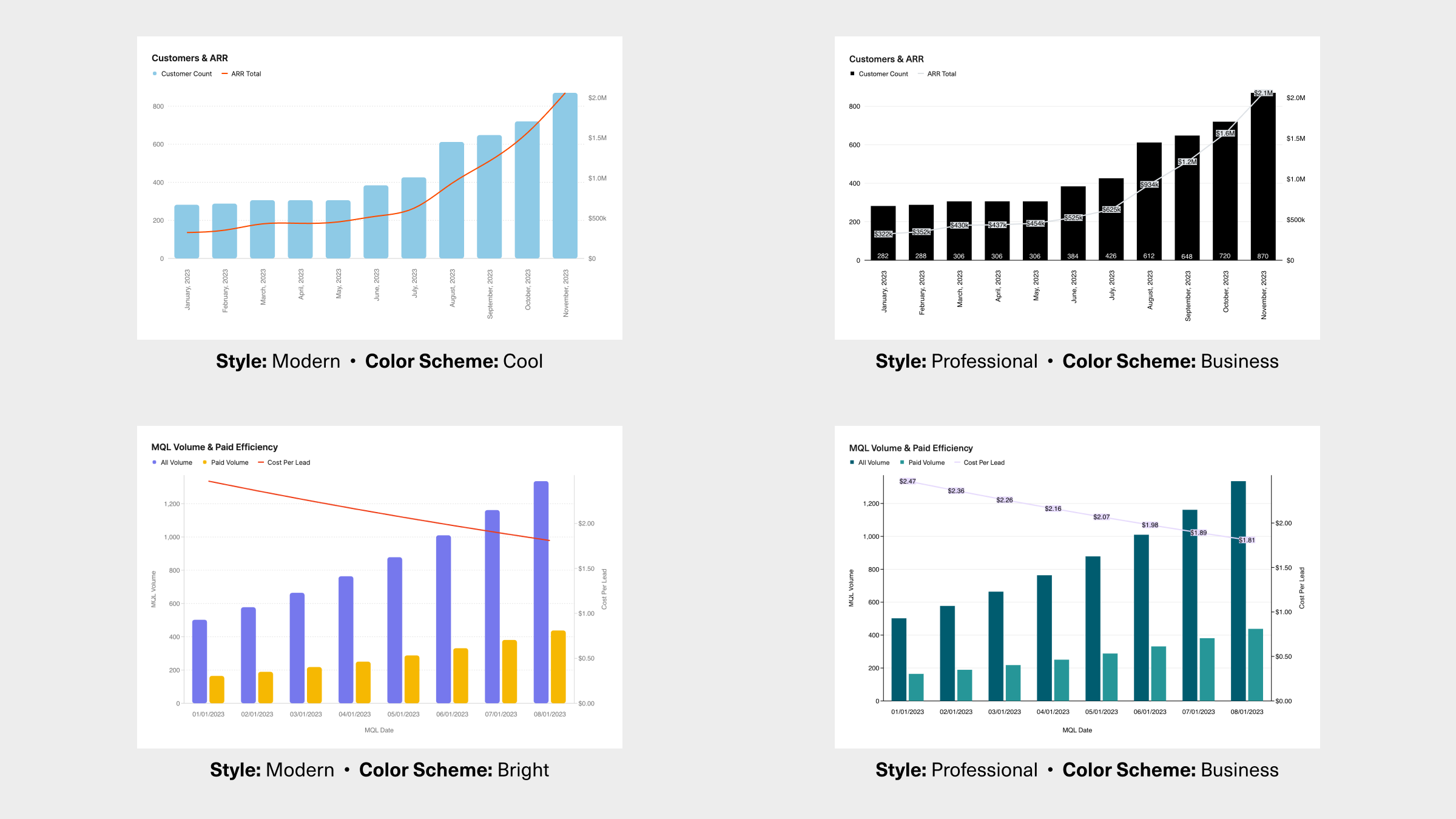
First, choose from one of the two available styles:- Modern: A bold look and feel with rounded edges, smoothed lines, and grey axes.
- Professional: A classic look with straight edges and lines, tick marks, and black axes.
Colors
Next, choose a color scheme for your chart. The options will vary based on your selected chart style:- Bright or Cool colors (Modern style)
- Business or Basic (Professional style)
- Purple or Stone for a monochromatic look (both styles)
+ icon to add your chosen set of colors. Once saved, your custom color scheme can be applied to charts in any Workbook and used by other members of your Workspace.
Title & Legend
Add a Title or a Legend and modify their position from the sidebar.Grid
You can also choose to apply horizontal and vertical gridlines, as applicable based on the type of your chart, for better readability.Series
In theSeries section, you can configure the way series’ from your selected data range are displayed in your chart. You can also drag and drop series to re-order them. To get started, click on a specific series to configure.
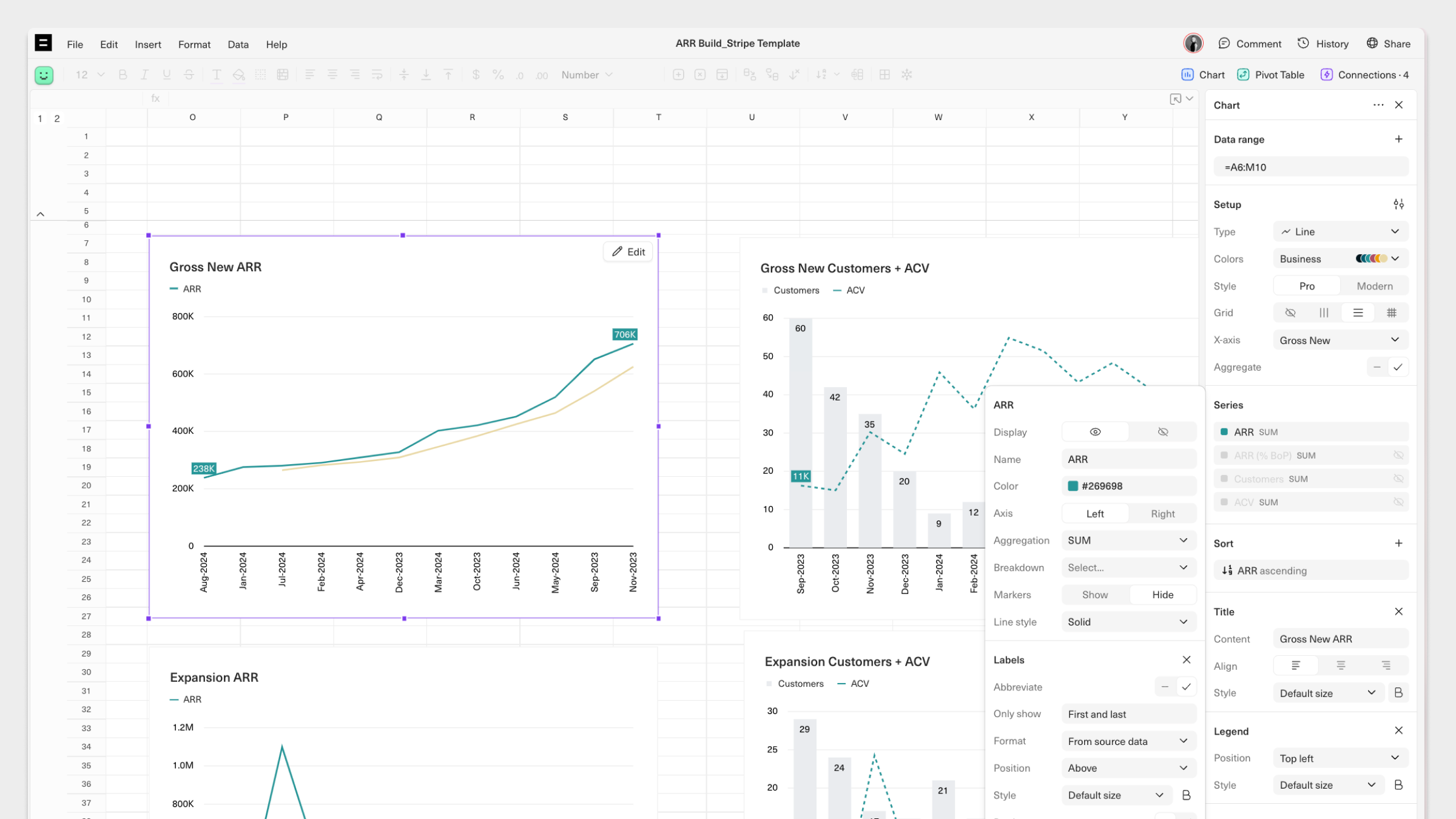
- If a specific series has been selected, give it a Name that will be displayed in the chart’s legend.
- Select a Color. This will be set based on the chosen color scheme but can be modified to be any color.
- Choose which Axis to chart your series on–the Left or Right Y-axis.
- Add a Trendline for your chart series and choose from several mathematical models, including Linear, Logarithmic, Exponential, and Moving average
- Decide whether to display Labels for each data point in your series and configure their format and positioning.
Axes
You can configure the appearance of each axis in your chart, including the X-axis, Left Y-axis, and Right Y-axis. In each section you can:- Add a Title for each axis
- Choose to show show a Line, Tick marks, and/or Labels
- Define the angle at which data labels will be displayed under Slant label
- Normalize the way data is displayed by selecting Log scale or a specific Scaling option. You can also use Limit to define min/max values.
Updating charts
If your chart is built on live data from an underlying query, you can enable auto-expand on the chart’s data range to automatically refresh it each time the query is run. This will ensure that your charts are up-to-date without the need to manually copy and paste data or expand data ranges. To manually update your chart, you can manually insert data into the chart’s selected data range. You can also adjust your data range to reflect new rows of data in your Workbook by selectingEdit in the top right corner of the chart, and then editing the Data range input.
Sharing charts
There are a few options for sharing and distributing charts:- Add your chart to a Dashboard that can be auto-distributed to your team via Slack or email on a set schedule.
- Download individual charts as a .PNG file by right-clicking and selecting Download chart.
Pivot tables Filters and sorts