Understanding workbooks
Analyses are built inworkbooks. Creating a workbook is like creating a document in a Word processor (e.g. Microsoft Word, Google Docs). If you’ve used Excel, it’s the equivalent of creating a new file.
Workbooks are comprised of multiple spreadsheet tabs (also known as sheets) that all can reference one another. The best practice is to keep workbooks as compact as possible so that as you add data and invite teammates to work with them, they’re easily understood and less likely to break.
We recommend keeping workbooks limited to one topic. For example, you might have a workbook that houses your revenue forecast. Another workbook that houses your product engagement statistics. And another workbook where you track your sales pipeline and forecast. You can link workbooks if you need to pull those things together.
Structuring your workbook with tabs
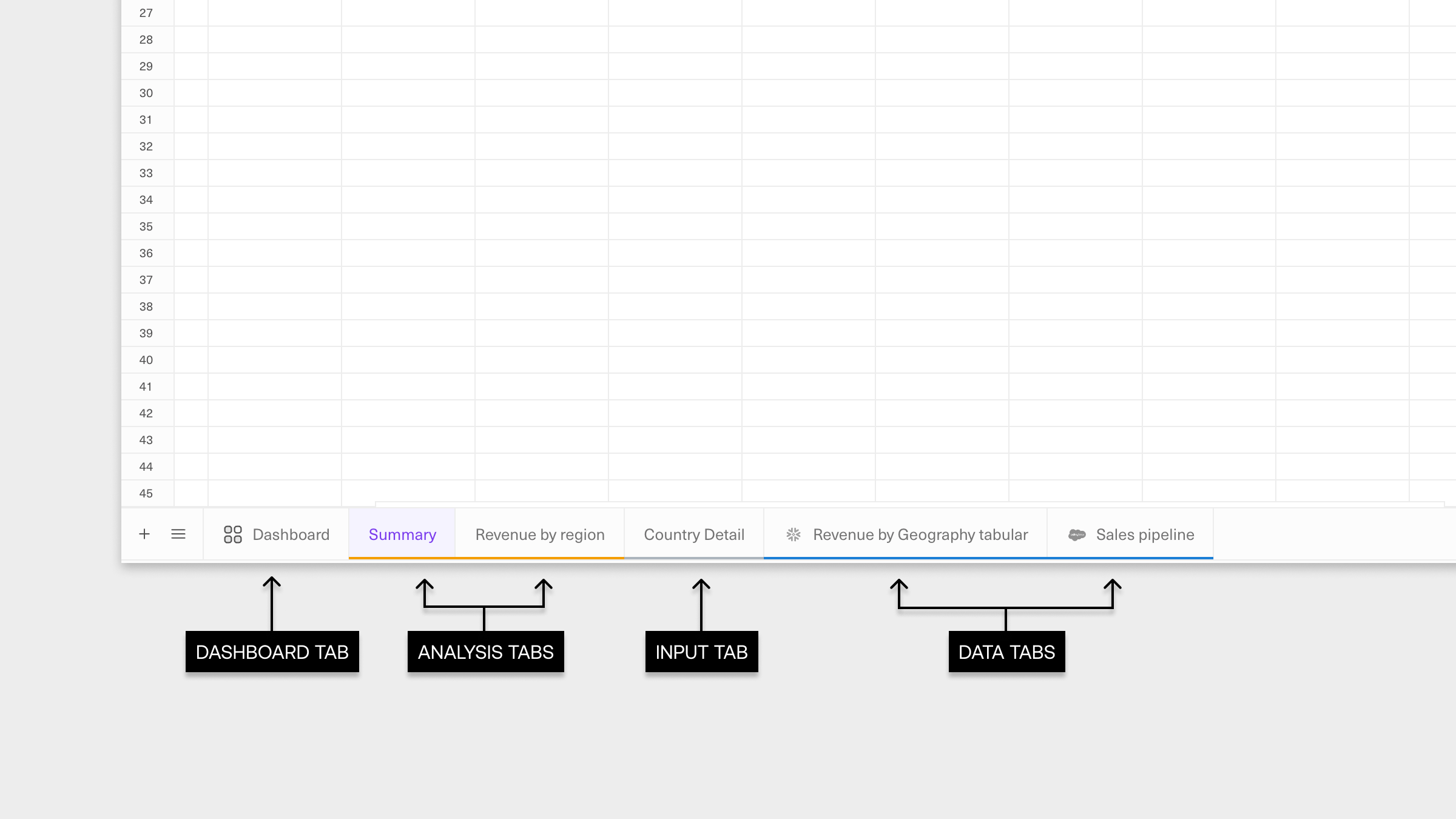
Knowing how you set up your workbook is important as you dive into an analysis. You want to organize your workbook so teammates can easily understand it and re-use it with minimal upkeep and chance of breaking. The best practice here is to organize the tabs in your workbook into four categories:- Data tabs. These tabs house the raw data returned from querying a data source, and are the foundation upon which your analyses are built. In Equals, you can build, run, and refresh queries directly from this tab to update your analysis. Keeping these tabs focused solely on your queried data outputs makes your workbook easy to understand, maintain, and scale over time. Don’t build your analysis in these tabs.
- Input tabs. These tabs house reference information you might use to build an analysis. They support the
DataandAnalysistabs and are typically manually maintained and updated. As withData tabs, don’t build analyses in yourInput tabs. - Analysis tabs. This is where you summarize or extract insights from your data using formulas to pull and aggregate data from your
Data tabs. This is also where you’ll do any further analysis – whether it’s simple metrics inferred from your aggregations, extrapolations, or visualizations, it should all happen in analysis tabs. - Dashboard tabs. This is where you can transform your analysis into a consumable format that highlights the most important insights in a logical order. With Equals’ dashboard builder, you can add charts, tables, cells, and more directly from your workbook. You can also schedule dashboards to automatically send to Slack or email - hourly, daily, weekly, or monthly - so stakeholders always have access to the latest data.
Grouping and color-coding tabs
We recommend grouping tab types together, i.e. allData tabs should live next to one another in a workbook. We also recommend color-coding tabs in the same category for clearer organization, e.g., make all your Input tabs gray and all your Analysis tabs purple. This will make it easier for other stakeholders to understand how your analysis comes together.
What’s Next