Dashboard tab in the bottom-left of your Equals workbook. You can add any chart, table (range of cells), or individual cell in your workbook to your dashboard. You can also add text headings, paragraphs, and auto-generated AI Summaries of selected tables and charts.
Create and edit access
Only worksace members withCan edit access to the workbook can create and edit its dashboard. See Manage dashboard access and permissions for more information.How to add objects to a dashboard
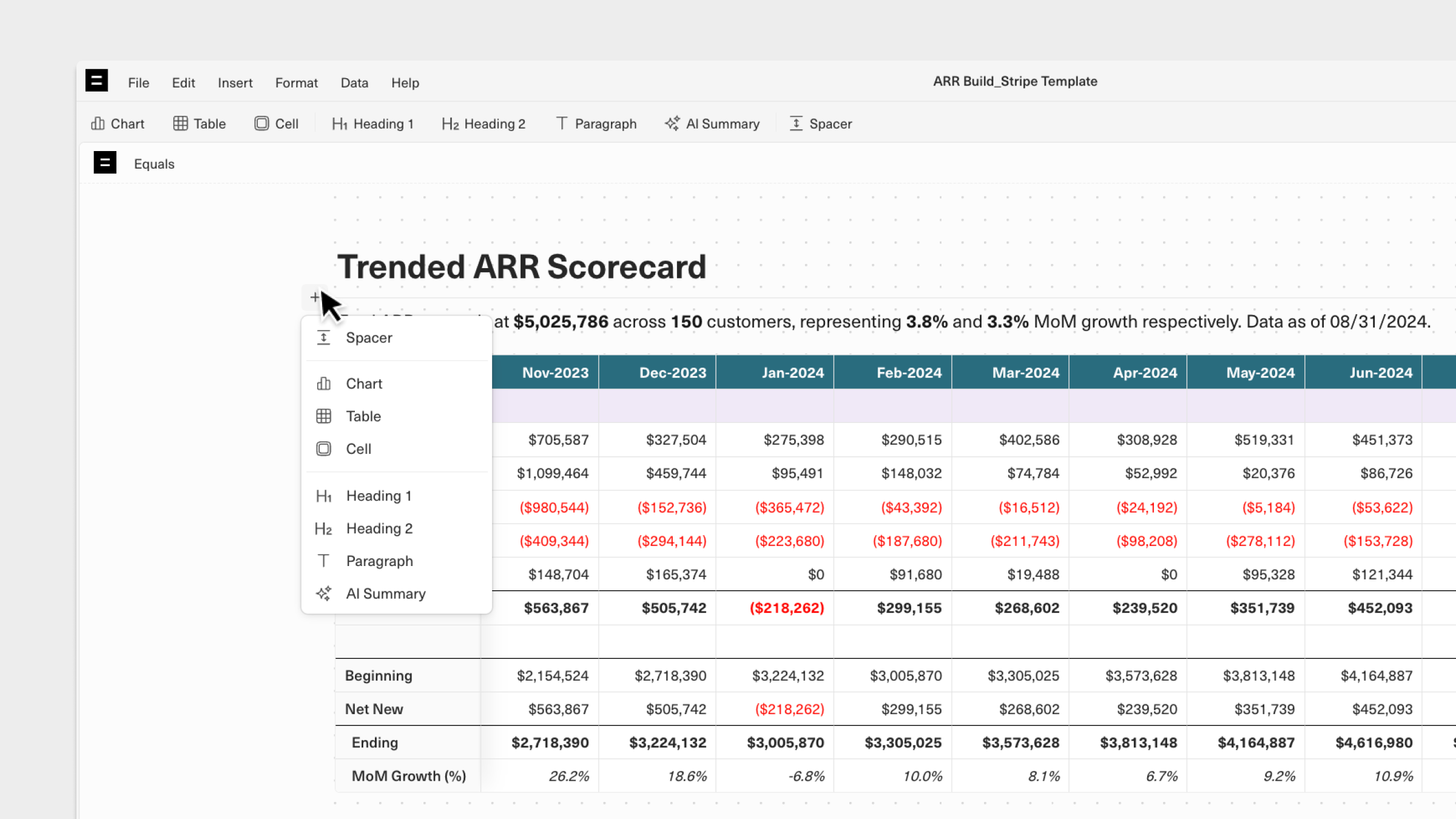
There are two ways to add objects to your dashboard:Toolbar
Like a Word or Google Doc, your dashboard has a toolbar at the top showing all the objects you can add.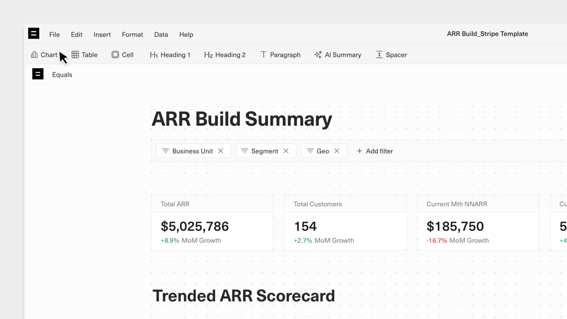
Inline Menu
When you hover between objects on your dashboard, you’ll see a+ icon appears. Clicking this provides quick access to an inline menu for adding additional objects to your dashboard.
Moving objects on a dashboard
Click, hold, and drag an object to move it into a different position on your dashboard. A purple bar will appear, indicating where you move the object to.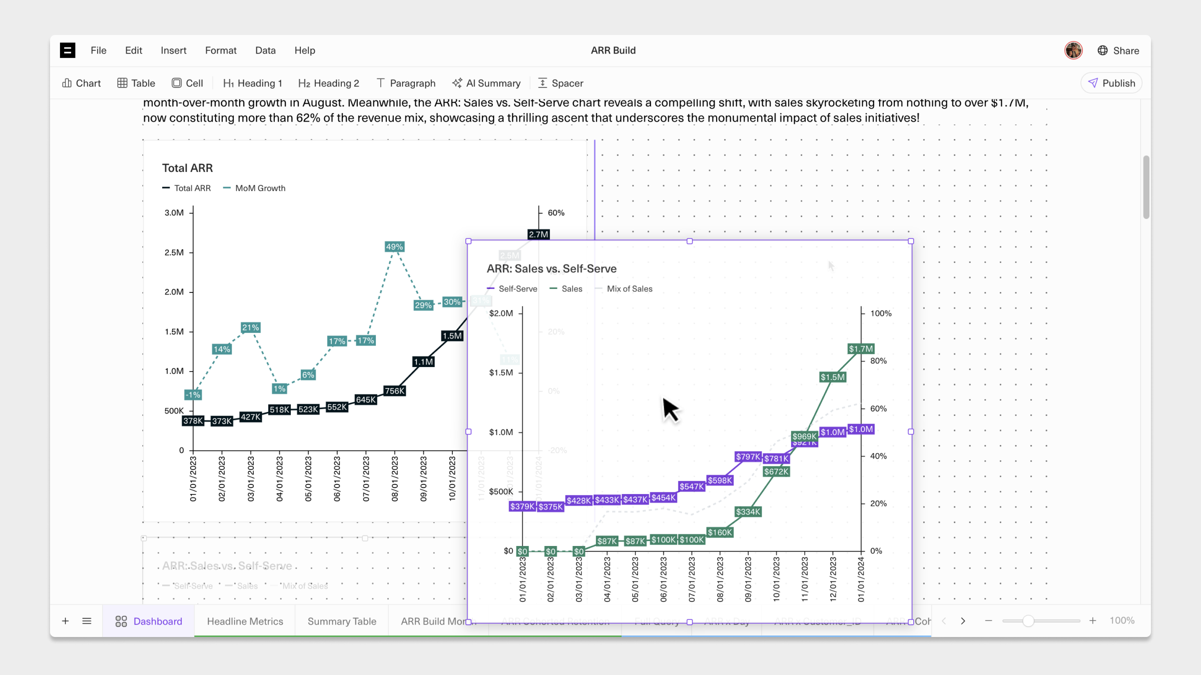
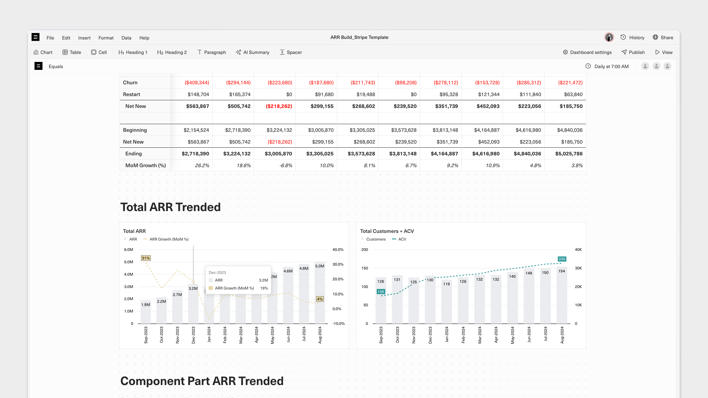
Adding and editing charts, tables, cells, AI Summaries, and text
From the toolbar or inline menu, you can add any chart, table (range of cells), or individual cell in the workbook to its dashboard. Complement your data visualizations with editable text headings, paragraphs, and auto-generated AI Summaries of selected tables and charts.Refreshing data on dashboards
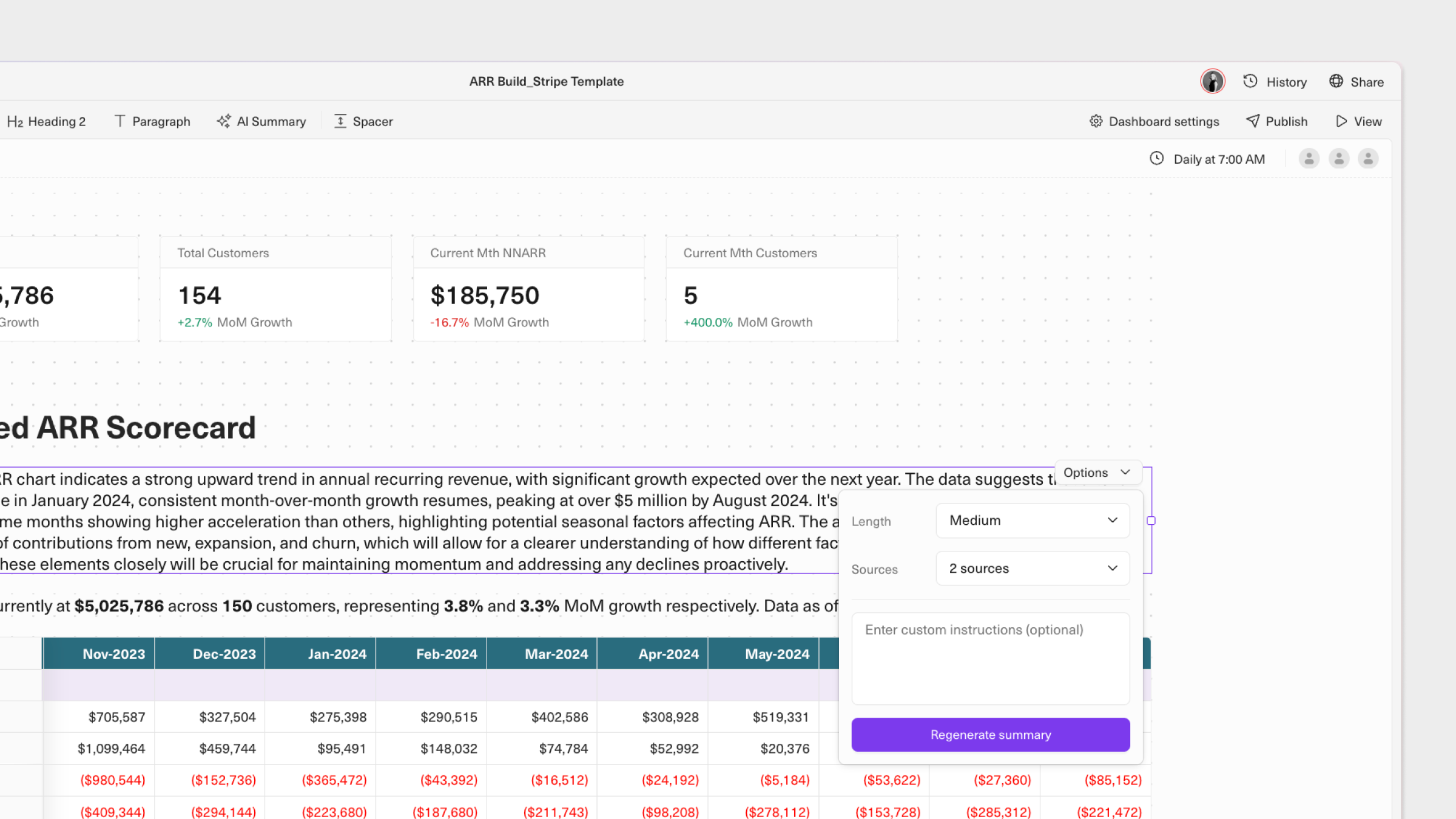
Charts, tables, and cells will automatically refresh when the underlying data is updated–either manually or automatically via a query. AI Summaries will automatically regenrate when the data in selected charts and tables are updated. They can also be manually re-generated via theirOptions menu.Charts
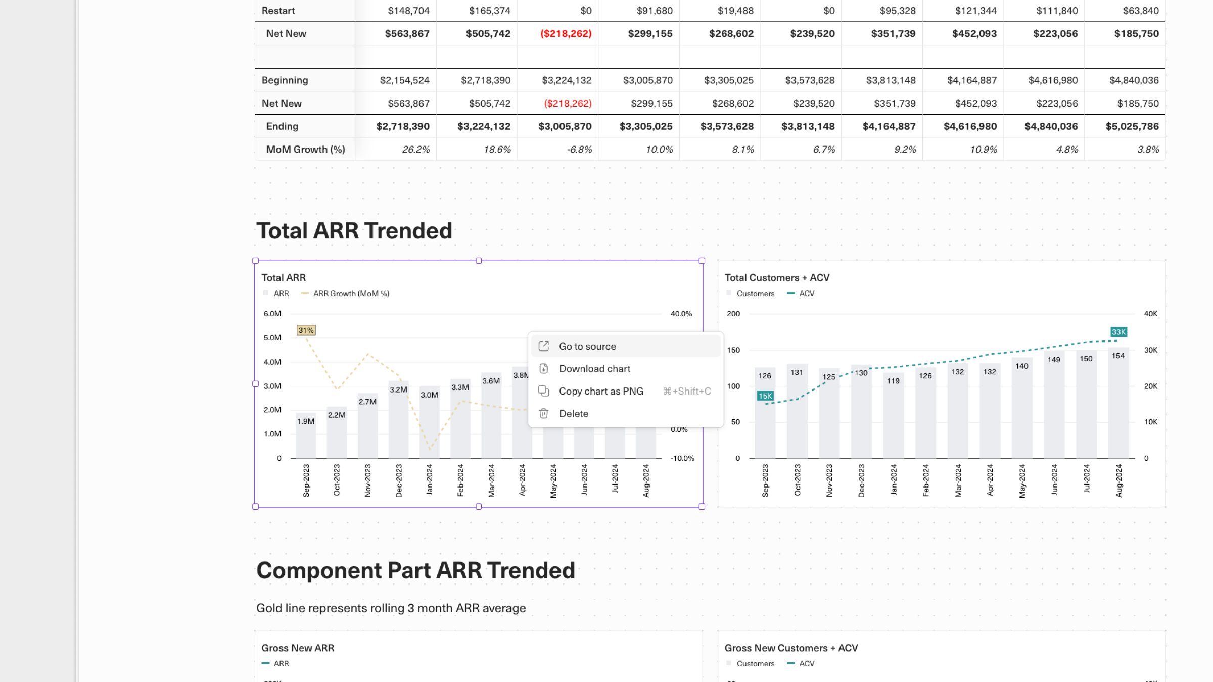
You can add any chart from the same workbook to your dashboard. Just select one or more charts from your workbook and clickSave.
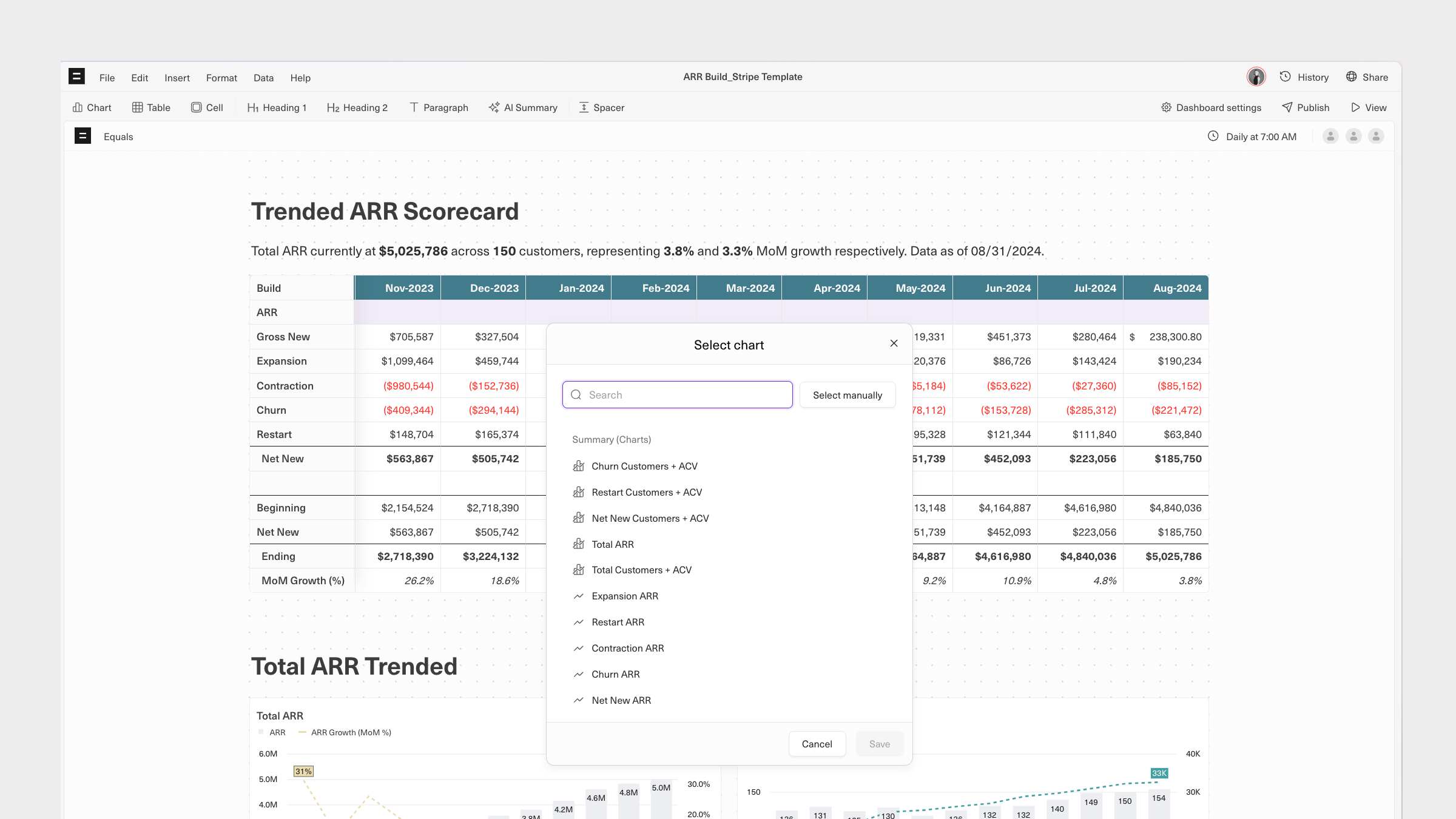
Go to source. From the right-click menu, you can also download or copy an image of the chart to your clipboard or delete the chart.
Tables
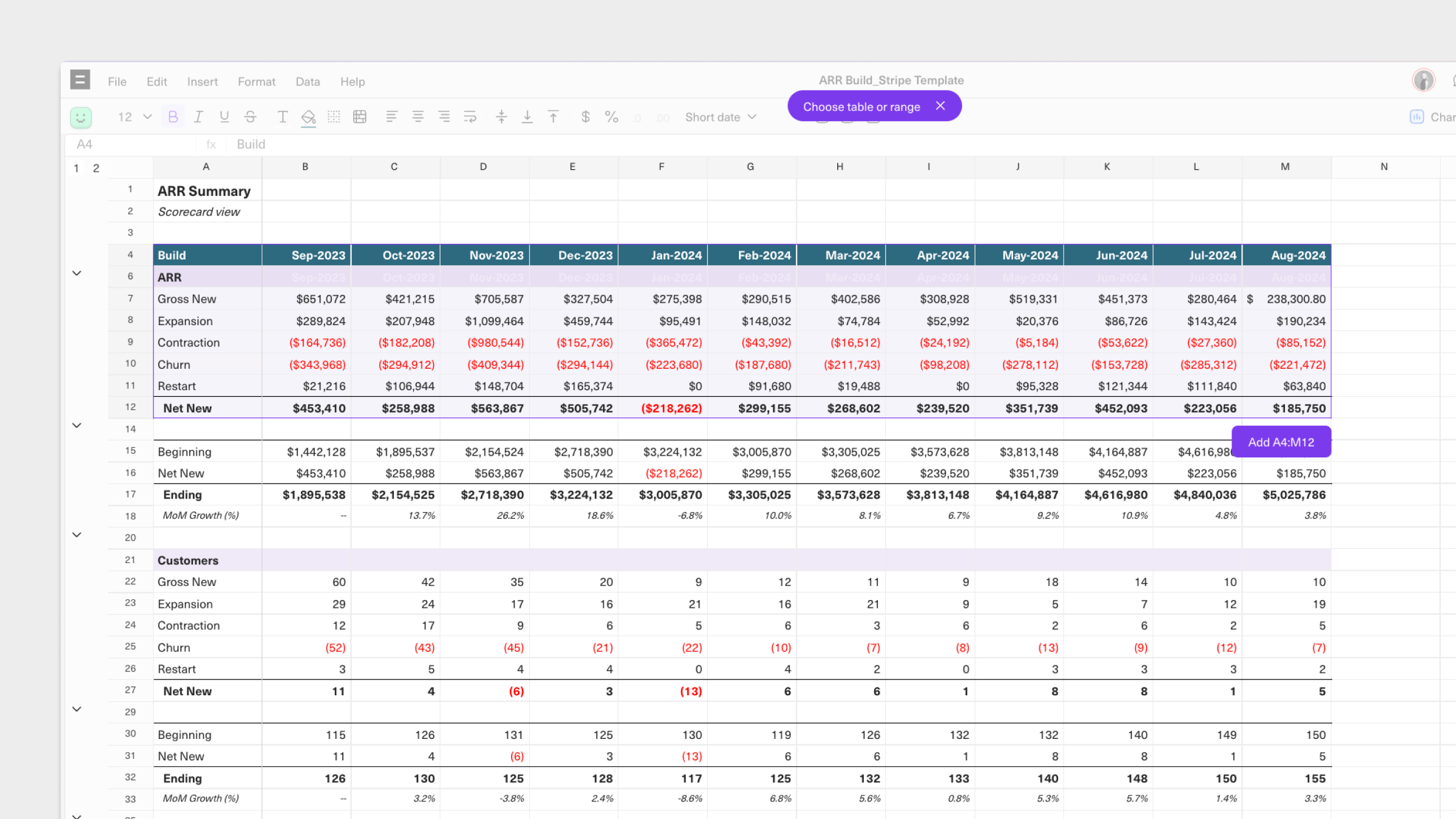
Add any range of cells to your dashboard by clickingTable in the toolbar or inline menu. You’ll be taken to the last sheet you were on to select a range of cells to add. Existing tables are automatically identified on hover. You can click and drag to select any range of cells, too.
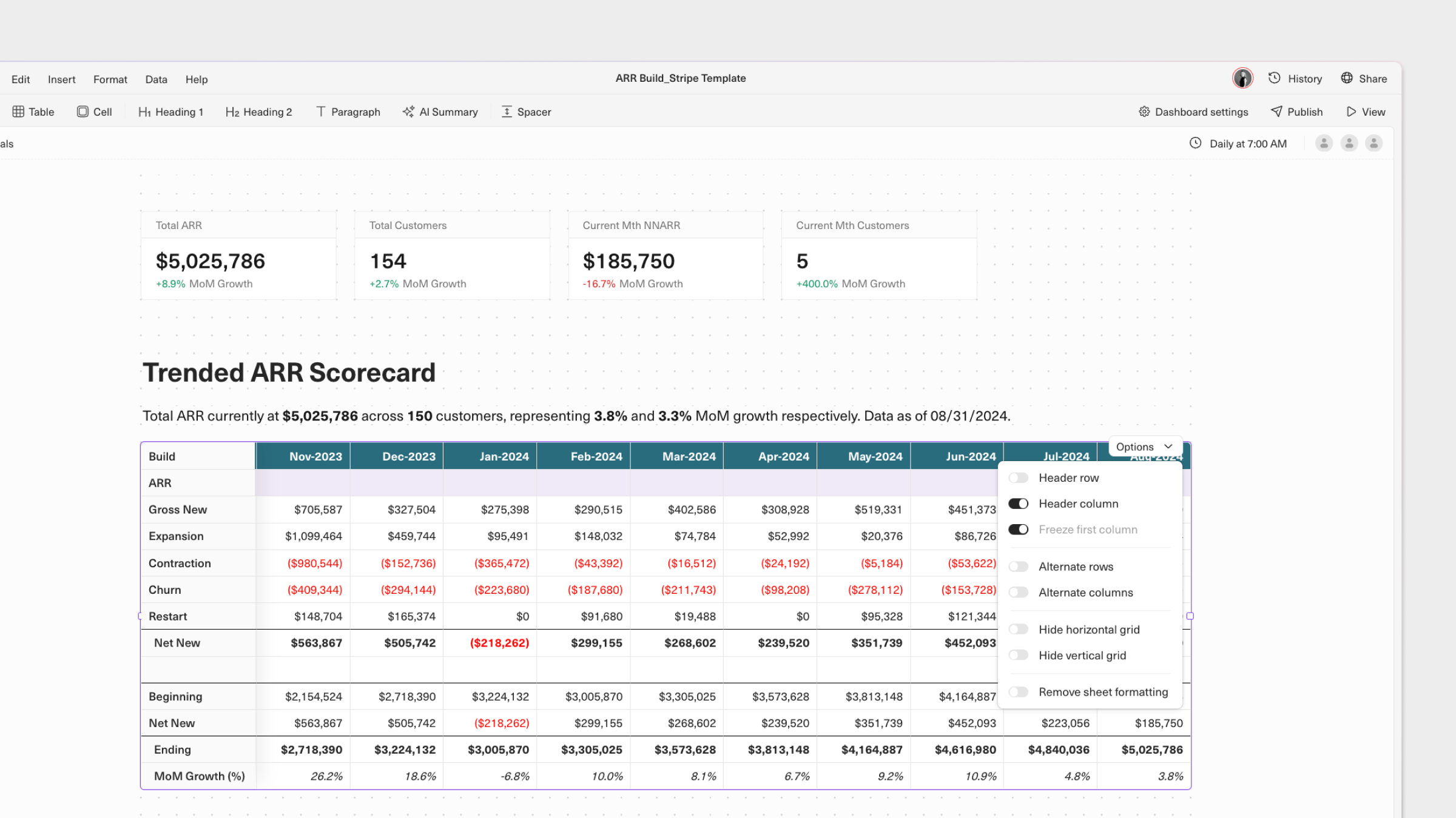
Options menu. There are numerous formatting options available to allow you to style them to suit the presented data best, including:
- Add a header row and/or column to bold its contents, add a light background, and keep it fixed on scroll
- Choose to alternate shading on rows and/or columns to improve the legibility of large tables
- Hide grids for a cleaner appearance
- Preserve the original formatting of the selected range of cells. If enabled, you will only have the option to enable a header column. All other formatting options will be disabled.
Go to source or Delete the table from the dashboard.
Cells
You can add any number of individual cells to your dashboard. This is particularly useful for highlighting top-level metrics and KPIs. Like adding a table, you’ll be taken to the last sheet you were on to select a cell to add. Once added, you give the cell a title and choose to inherit or customize the format from the cell’s source data. You can also abbreviate values, useful when reporting on revenue or KPIs with many insignificant integers.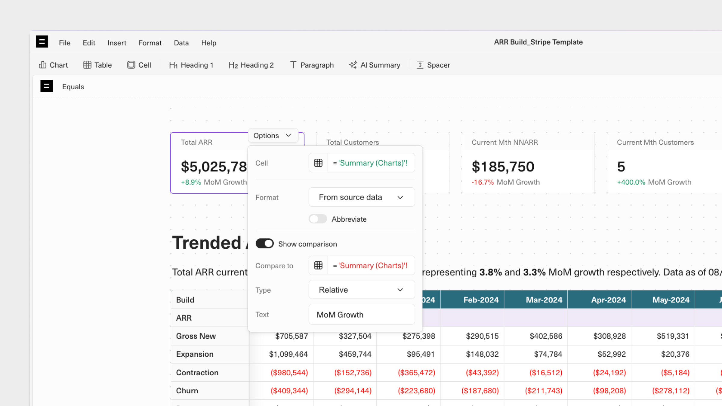
Show comparison to select another cell in the workbook to compare against in relative or absolute terms. This is particularly handy when you’re reporting on KPIs over different periods.
AI Summaries
Add AI Summaries for auto-generated analyses of selected tables and charts on your dashboard. First, select the tables and charts you want to generate an AI Summary–you can select more than one if you like.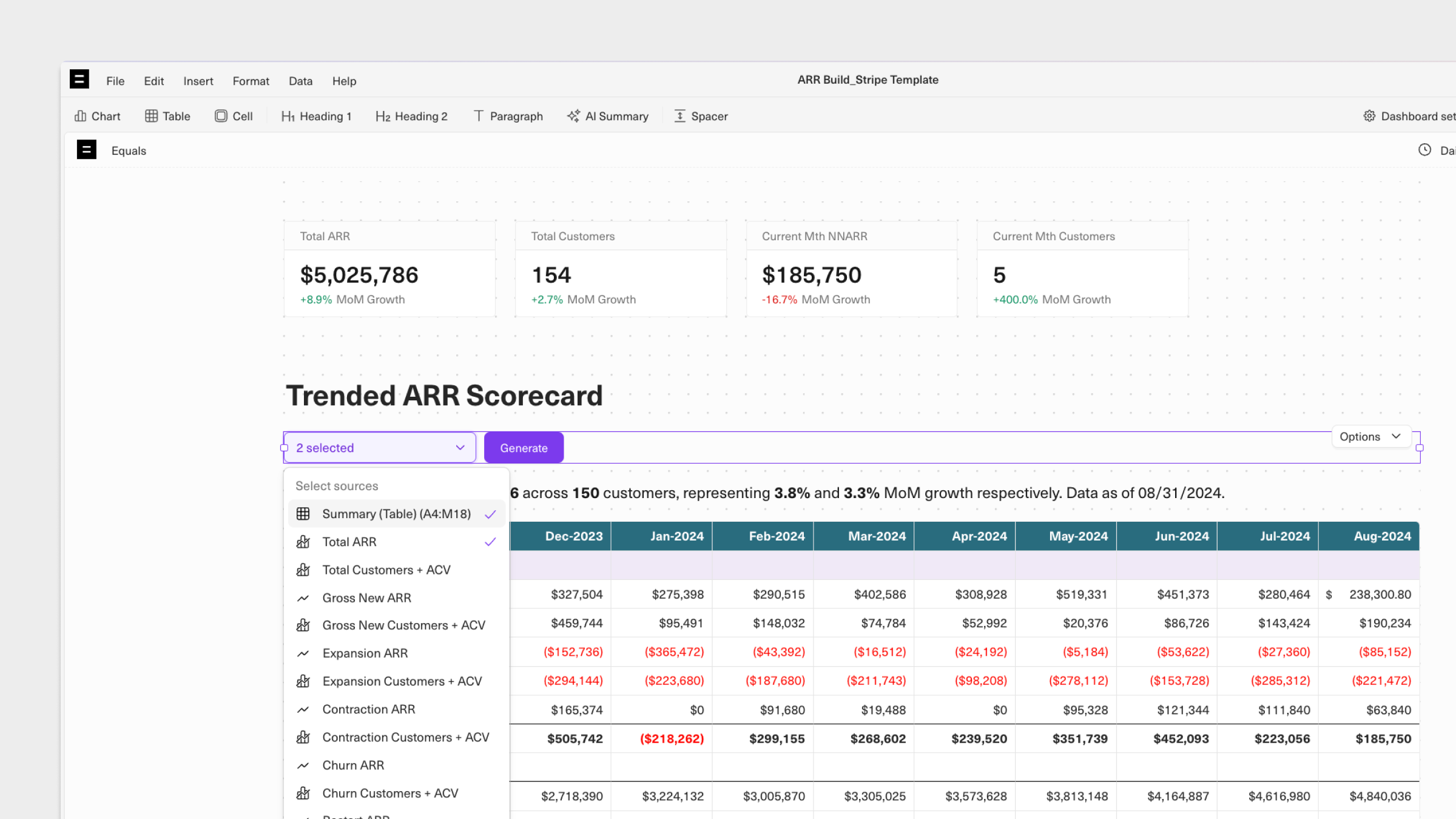
Options menu.
Headings and Paragraphs
Text headings (H1 and H2) and paragraphs can be added anywhere on a dashboard. Paragraph text can be formatted using Markdown, and cells in the workbook can be referenced in both paragraphs and headings.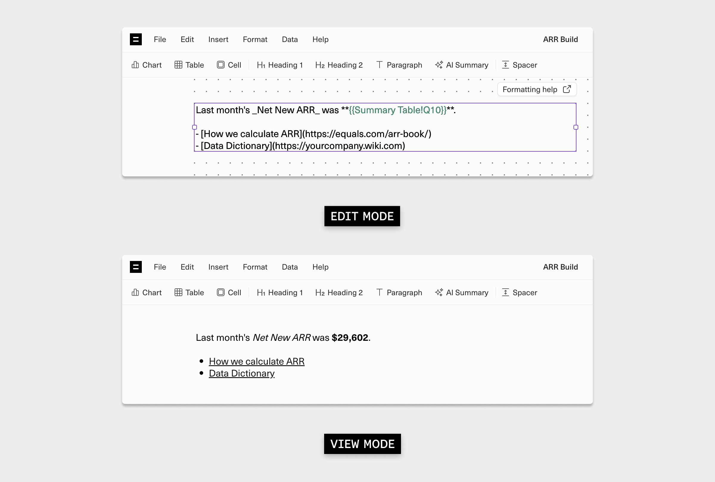
Spacers
Add height-adjustable spacers to delineate sections and aid flow throughout a dashboard.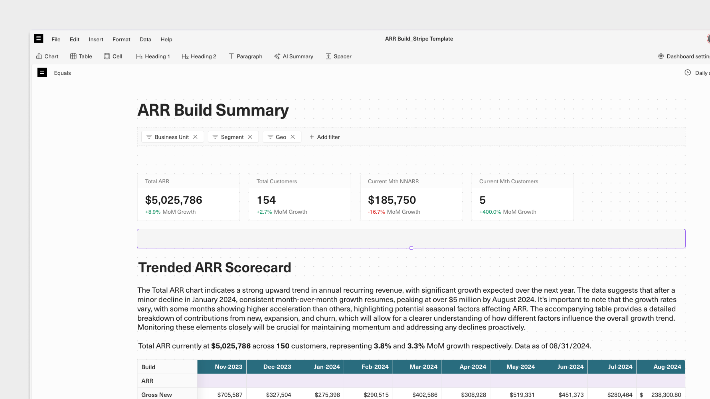
Resizing objects on a dashboard
After selecting an object, click and hold any of the handles that appear to adjust the width or height. A dynamic size indicator will help you ensure objects are the exact size you want. Height and width measurements are calculated based on the number of dots on the underlying grid that appears when a dashboard is being edited. Note that resizing a chart or tables will not modify the size of the original chart or table in your workbook.Resizing charts
You can adjust both the height and width of charts.Resizing tables, cells, AI Summaries, and paragraphs
You can adjust the width of tables, cells, AI Summaries, and paragraphs. With tables, the column width ratios of the original table are maintained. To reduce the actual width of columns, you will need to resize the columns in the selected data range.Resizing spacers
Spacers can only have their height adjusted.What’s Next